If you’re viewing the map from a pc, click on the image and visit the full HTML page to hover over counties and see the labels!
If you’re coming from NowIKnow, welcome! I blog about building businesses and growing in entrepreneurship, technology and philosophy.
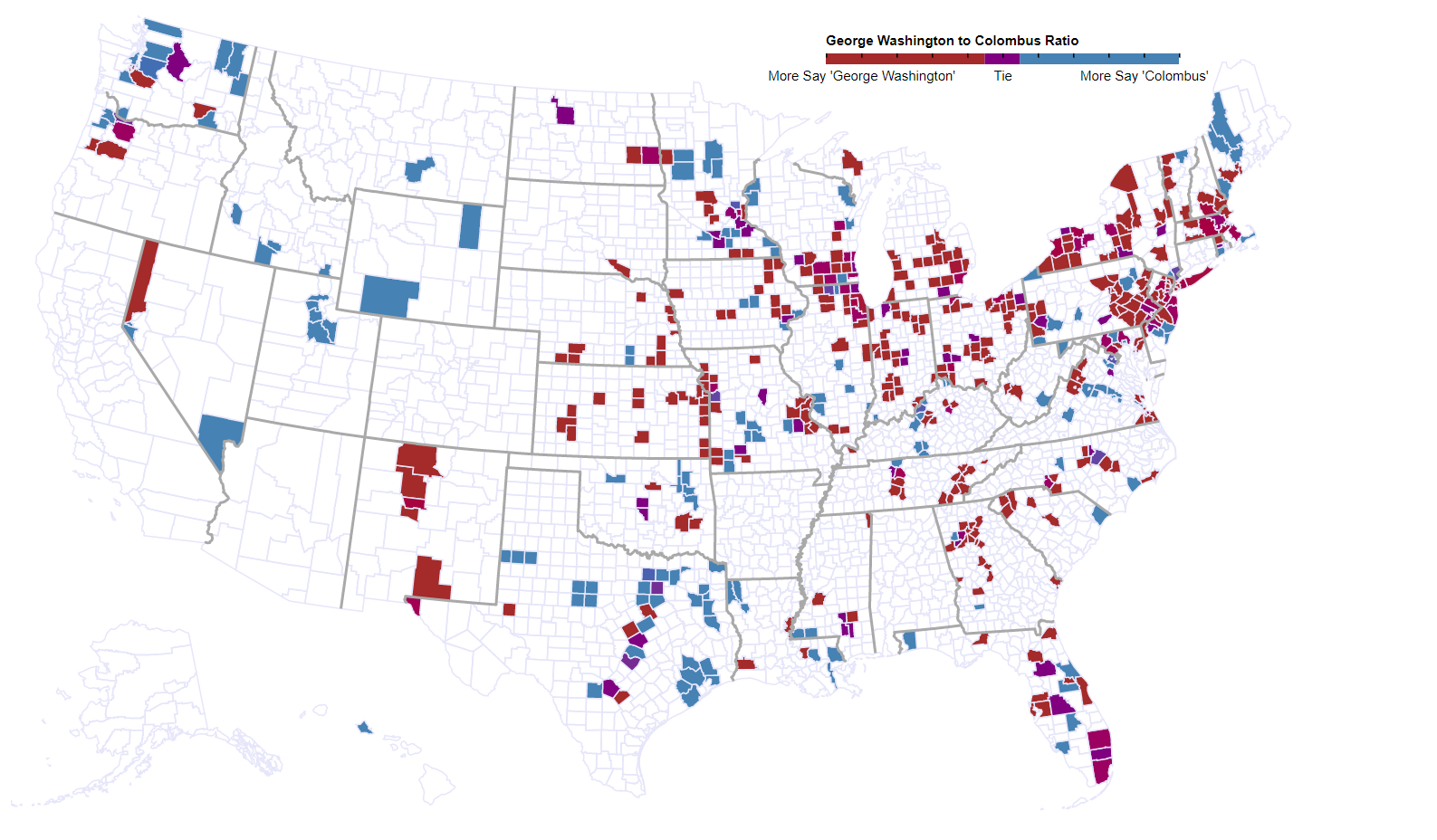
I want to give a big thanks to Dan Lewis for helping me sharpen my skills and make this map for you. What you are looking at is a representation of each USA county with a comparison of more People saying ‘George Washington’ to more people saying ‘Columbus’ from the song “Rudolph the Rednosed Reindeer”. A stronger shade of red over a county indicates more “George Washington”. A stronger shade of blue over a county indicates more “Columbus”.
The details:
For those who didn’t know, Dan Lewis (from NowIKnow.com who shares in interesting fact every day. Follow him!) ran a quick survey to identify regional word tendencies within the song “Rudolph the Rednosed Reindeer”. Perhaps you can imagine singing it with the often-beloved commentary and echo style
Rudolph the red nosed reindeer. [echo] reindeer. Had a very shiny nose. [addition] Like a light-bulb!…
Dan noticed that it seemed some people across the USA and world were saying different words in some points. Especially, the end of the song seems to have the most variation;
You’ll go down in his-tor-y! [addition] ….[???]
What comes in at the end?
How we built the map [can get a little technical!]:
We are going to use D3.js or (Data Driven Documents), a JavaScript library built by Mike Bostock of the New York Times. In short, this JavaScript takes data and binds it to charts and graphs that can be added to web pages and blogs! We’ll use a map, loosely following Mike’s Choropleth example, specifically narrowed to the USA to cover a large chunk of Dan Lewis’ data. To do this, we need the following:
Acquire and Cleaning/Transforming data
Dan shared us the data with Zipcodes. Zipcodes are great for knowing exactly in which sub-region you live. From a Zipcode/postal code, you can extract, city, state, country and some other postal information. However, zipcodes are much less useful when mapping.
Did you know there are a few zipcodes that span multiple states? No matter, we can ignore those since there aren’t many.
The larger problem is that the amount of zipcodes is far bigger (and slower to render on a webpage). After attempting unsuccessfully to make zipcodes work, we decided to transform USA zipcode to USA county by using a Postal code to zipcode comparison. You can us USA Postal service or other organizations such as US Medicate data that is regularly updated to give you such a comparison. Once transformed into county, we were ready to rock and roll.
Each data row was collapsed by county. (E.g. Lancaster, PA | 2 | 0| 1| …) Afterwards, we did some housekeeping such as removing extra text, collapsing with multiple counties, removing rows not following answer pattern, etc.
To simplify the work, we start by filtering on those who say “George Washington” or those who say “Columbus” and narrow our focus to just the United States. Since we are doing a binary comparison with only two choices, this makes it easy to perform a zero to one scale
(0=100% chose “George Washington”, 0.5 = Tie, 1=100% chose “Columbus”)
Finally, the County and ratio is exported for with our map to come.
Load data/bind it to web page
We are now ready to bind some data. We use D3 as the ‘glue’ to tie the now cleaned data to an HTML page and appear on a website!
We can direct D3 such that for each row of data coming in, we want D3 to show that data under a certain pattern. In our case, we want to use a prebuilt encoding of Topological data to draw out a map.
Once this is done, you can customize colors, transparencies, create a key in a similar fashion, and add any interactivity you wish. We added a mouse hover to this map so you can see exactly what a certain county reported.
Summary:
It was a whole lot of fun building this for Dan. One of the purposes of visualizing data is to see the big picture and help make sense of it. I hope this map helps organize to start to tell a story.
Isn’t it interesting that Texas seems to tend towards “You’ll go down in history…Like Columbus!” Perhaps because of some Spanish cultured influence?
Why does it seem a state could be mostly one color, but larger metropolitan areas seem split? Might you expect it to be regional and independent of location population? Perhaps this indicates tradition along migration path? Perhaps more data in metropolitan areas tends towards diversity. Who knows, but now you can have an easier time asking the questions!
Thank you for reading and glancing at the map!
Need a visualization or interaction built for you? Drop me a line and let me know!
Longtime D3 user here, always happy to see the software get some attention. Nice work, and nice description of how you did it!
One suggestion: update the hovertext to give the actual numeric values. Since I can see the color of the region before I put the mouse over it, the current hovertext doesn’t add much. Thanks!
Thank you for the kind words! I wasn’t sure by making it a 0 to 1 floating point scale that anyone would understand if a fill might say .888 towards George. I’ll have to give it some more thought.